During my senior year, I had the opportunity to choose a studio class outside of my required ones. I chose Cultural Relevance. The point of this class is to be comfortable with marketing to people who are not like you or who you may not usually market to in your day to day. We were given a made up acne brand called ClaroBenz+ and were instructed to create a logo, brand guide, packaging, briefs, personas and advertisements for this brand. Our instructed target audience were Latino Americans in their 20s-30s who have busy lifestyles and struggle with acne.


Brand Guide
After calling a family member who falls in the target audience, she explained that she resonates with the colors turquoise, emerald green, goldish yellow, and burnt orange and they remind her of Latino culture. I chose to represent/target Latino cultures through my color choices and keep the logo and typeface very simple and clinical oriented. I chose an open typeface to resemble the bubble shape and to keep the design very clean, to resemble how it will clean their acne. The bubble logo is to represent the clearness that the product brings to your face and it features four dots/bubbles to represent the four circles in the Benzoyl Peroxide chemical compound.


Packaging Brief
In this class, I learned how to write a creative brief for the first time. We were given the project, scope of work, product, key ingredients, and target audience. However, we had to come up with our own secondary audiences, USP’s, visions and aspirations, objective, tone, and key messaging.

Packaging Mockup
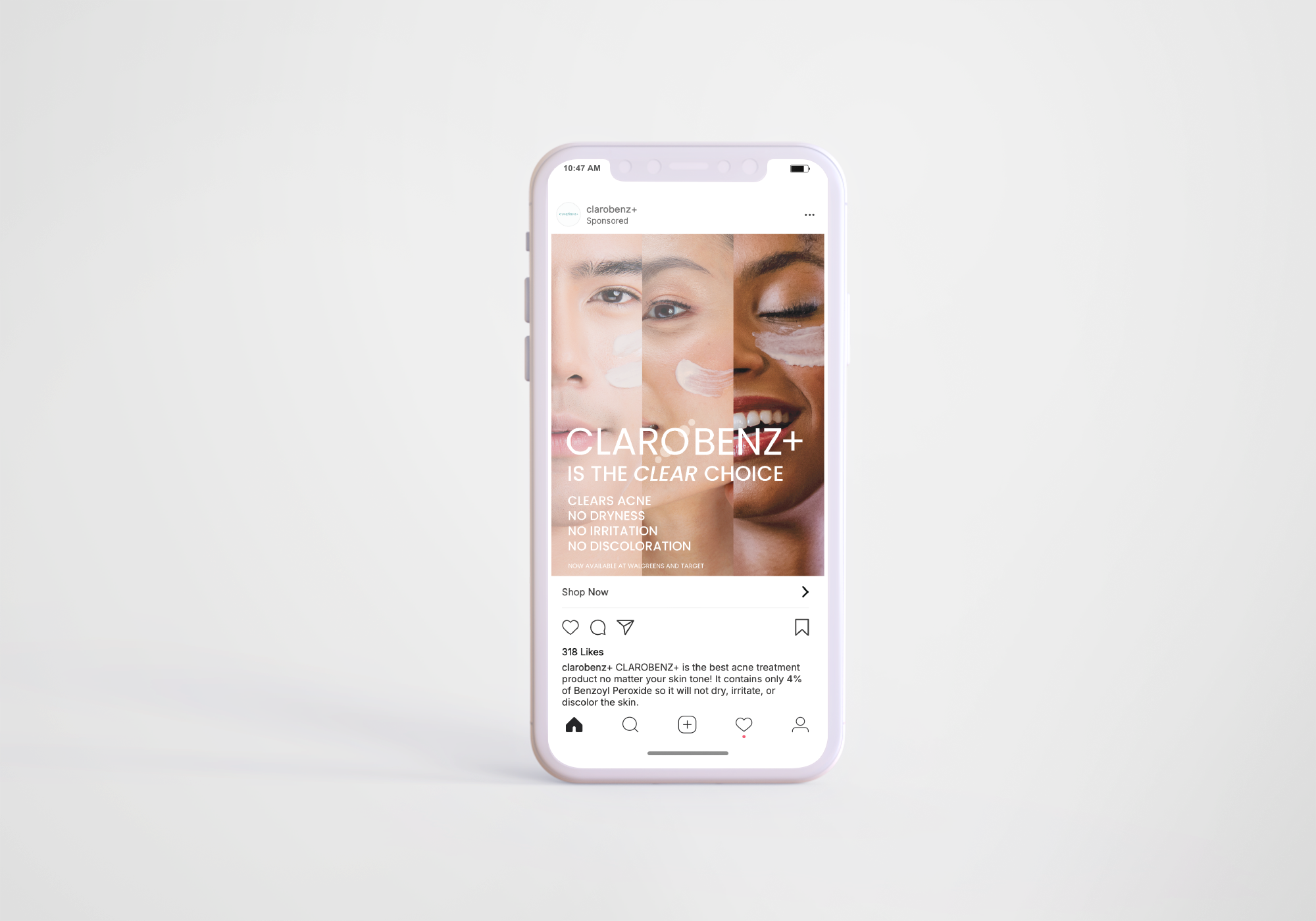
I decided I wanted the main highlight to be “Compatible for all Skin Types” so that the box targets my primary and secondary audiences. The phrase is inside the bubble representing how that is the clear point and the point in focus. It also represents the transparency and honesty of our brand through the transparent color. I chose yellow to be the color of the box because it is a welcoming, friendly, and inviting color showing the brand is inclusive to all. I decided to put “4% Benzoyl Peroxide” in orange to be more of a bold statement because it is important that the customer knows it is below 6% because at a high percentage, Benzoyl Peroxide can bleach the skin.
Inside of Packaging
I decided to do a more playful and colorful inside of the box since the outside is very clean and simple. I learned that the die cut and dimensions for the inside of a package is different than those of the outside of a package.


Social Media Ad Brief
Similar to the packaging brief, we had to write a brief for our social media advertisements. In addition to the steps from before, we also had to address the KPI’s, or how we would track our ad’s analytics hypothetically, the CTA, and the language of the ad. We had to do immense research on what types of ads perform well with our targeted audiences and which languages resonate with them most.

Social Media Ad in Spanish
I decided to do my ad targeted more toward my primary audience, Latino Americans, in both Spanish and English. I learned that Latino Americans often times do not seek medical help with acne because they either think that the acne is their fault and they are embarrassed about it, or they think that potential acne treatments will cause irritation, dryness, or discoloration. So, I decided to address those concerns in the ad. It reads “ClaroBenz+ is the clear choice. Eliminates Acne, Without Dryness, Without Irritation, Without Discoloration.”
Social Media Ad English
This is the same ad with the same wording, just in English. According to my research, most Latino Americans are bilingual and some actually prefer ads in English.

Social Media Ad Broad Audience
I decided to do a second advertisement which is more targeted toward my secondary audience, African Americans, and more general broad audience of any people with darker complexions. Instead of addressing the specific concerns of Latino Americans, I decided to address the overall concerns of acne products causing dryness, and capitalize on the complexion-compatibility of my product. The word “clear” being italicized in the catch phrase is a play on the name “ClaroBenz+” because “claro” means “clear” in Spanish.
-
![]()
PETERMAN X NAPOLI
-
![]()
OBESITY AWARENESS AD
-
![]()
FREE REIN COFFEE COMPANY
-
![]()
LOUBOUTIN X RIPCURL POPUP
-
![]()
CLAROBENZ+
-
![]()
CITRINE NATURAL BEAUTY BAR
-
![]()
JUJYFRUITS PACKAGING REDESIGN