JUJYFRUITS
PACKAGING
In my Visual Communications class junior year, we were assigned a packaging project. For this project, we were to choose a product that we feel could perform better and redesign its packaging based on competitor research and what is performing well in the industry in modern day. We were to establish the target audience, whether it stayed the same or changed, and have reasoning to back up our design choices.
Selected Packaging
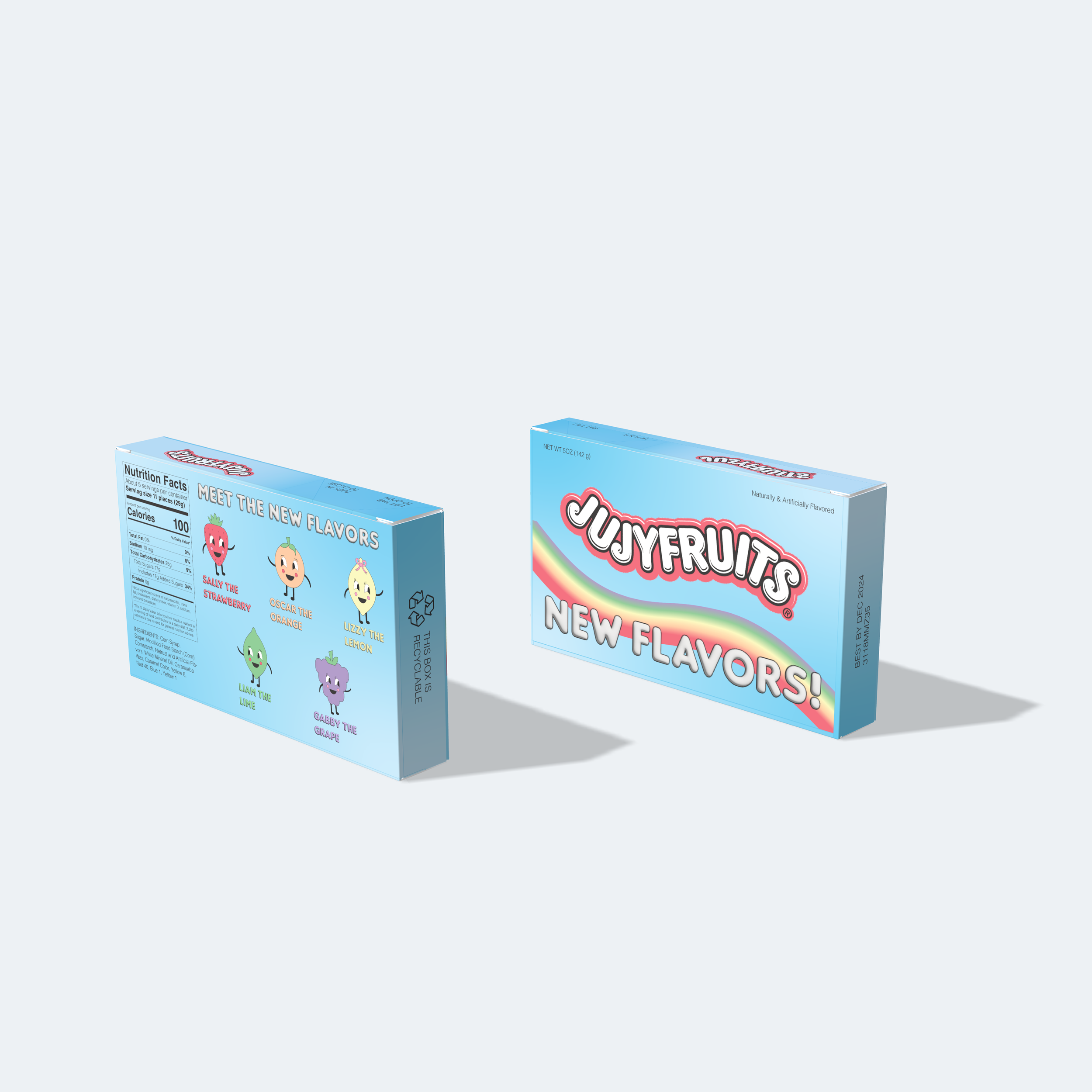
I chose to redesign JUJYFRUITS because it is something I remembered eating as kid, but I no longer see them in stores. It was a staple movie candy in my childhood and I want to see it come back in stores as a more modernized candy. After assessing the packaging, I realized a few things were off. The name is JUJYFRUITS, and the flavors were all fruit flavors, but the shapes were vegetables. The flavors consisted of lime, raspberry, lemon, orange, and anise (licorice) but the shapes were asparagus, bananas, grapes, pea pods, pineapples, raspberries, and tomatoes. I found this to be a misleading design choice. So, I chose new, popular and relevant flavors and made the shapes actually match the flavors. My main selling point if JUJYFRUITS were to come back in stores would be the new flavors so I wanted to really highlight that on the box .


Original Packaging
This was JUJYFRUITS’ original packaging. According to my research, the main reasons why JUJYFRUITS’ were no longer performing well and are no longer sold in most stores is because the packaging and flavors are outdated. The original target audience is now old and the intended buyers are not coming in stores to buy candy as frequently as they used to. The flavors and color choices were oriented to an older generation because it is nastolgic of their childhood and their time. However, the color yellow and the flavors anise and raspberry do not resonate with the newer generations as much. So, I decided to change my target audience to children. Children are one of the top candy consumers and when they are drawn to something in a store, they make it known and usually the parent ends up buying it.
Again, my main marketing point is the new flavors. Since my new target audience is children, I decided doing a playful box would be best. Children tend to resonate with cartoons and often times have imaginary friends, so I thought turning the flavors into characters they can “meet” would be more meaningful than just slapping the flavors on the box. I gave all the flavors names and made cartoon-like illustrations of the characters.
The Campaign


Special Edition Box
Since Halloween is the number one selling season for candy, I thought that making a “Spooky Edition” box would be a good opportunity to skyrocket the sales of the JUJYFRUITS relaunch. I decided on slightly different flavors that were also popular among children for the “Meet Your Monsters.” The “Batty Blueberry” plays a vampire, the “Frankenstein Lime” acts as Frankenstein, the “Witchy Watermelon” is a witch, and the “Mummy Mango” represents a mummy.

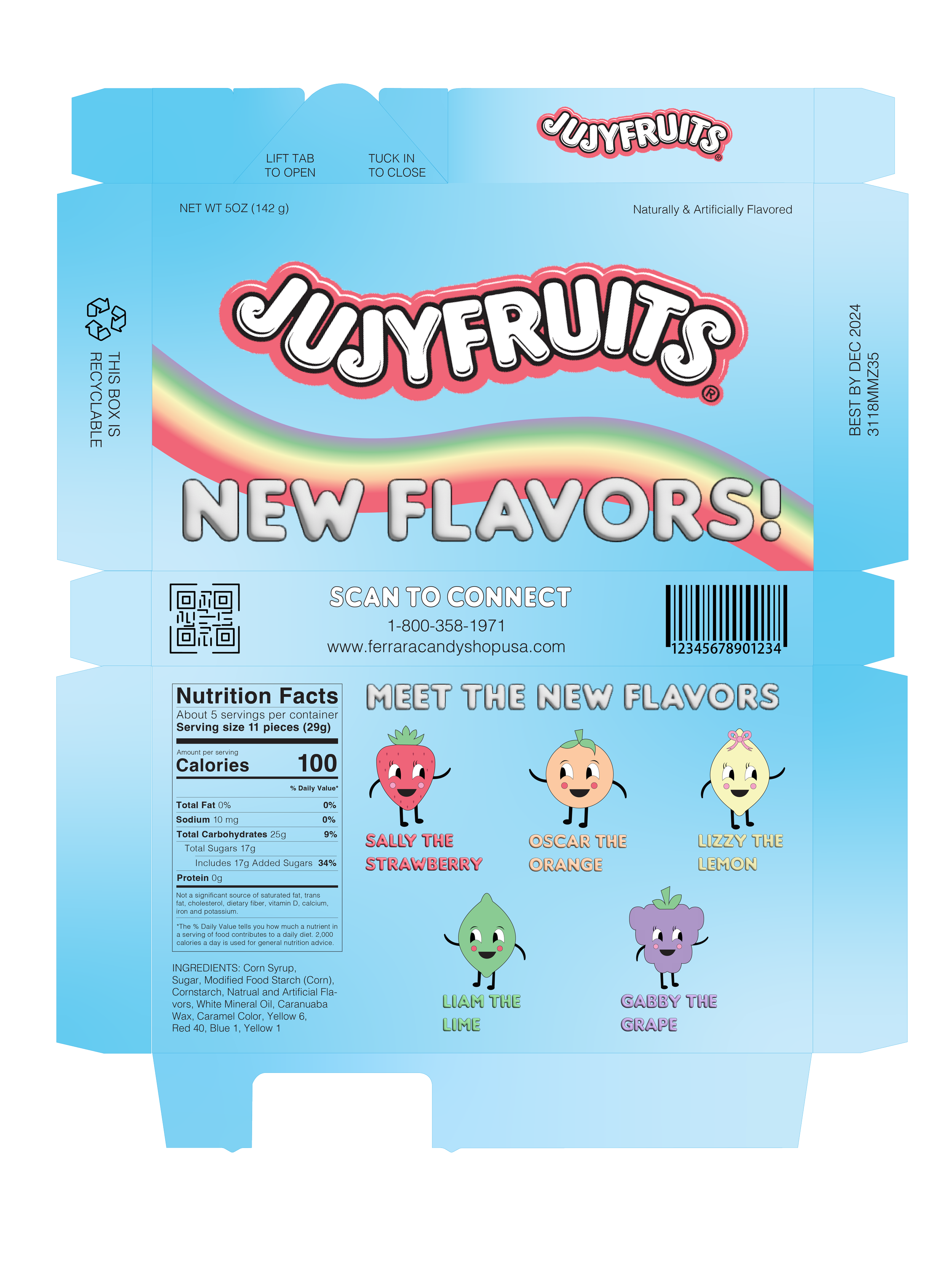
We had to look up all the required information that has to go on the packaging and get familiar with FDA rules and symbols. This was definitely helpful to learn. Additionally, we learned that it often times looks much better when you create your own Nutrition table rather than using the FDA’s automated one because you can manually adjust the leading and kerning.
The Diecuts
-
![]()
PETERMAN X NAPOLI
-
![]()
OBESITY AWARENESS AD
-
![]()
FREE REIN COFFEE COMPANY
-
![]()
LOUBOUTIN X RIPCURL POPUP
-
![]()
CLAROBENZ+
-
![]()
CITRINE NATURAL BEAUTY BAR
-
![]()
JUJYFRUITS PACKAGING REDESIGN